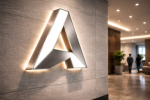
The right storefront branding ideas can turn a business exterior into a powerful visual touchpoint that attracts attention and builds recognition. Before customers enter a store, showroom, restaurant, salon, office, or experience centre, they have already formed an initial impression based on what they see outside. Signage, lighting, colours, window displays, graphics, and entrance design all contribute to how a business is perceived.
For store owners, entrepreneurs, Brand Directors, and Brand Managers, creating an effective exterior requires more than displaying a company name above the entrance. Every visible element should support the identity of the business while making the location easier to recognise and understand. Additionally, the design needs to work across different viewing distances, lighting conditions, architectural environments, and customer movement patterns.
A thoughtfully designed exterior can also connect the physical location with other customer touchpoints, including packaging, advertising, websites, and social media. As a result, customers experience a more consistent and recognisable identity wherever they interact with the business.
In this guide, we explore ten practical approaches that can help businesses improve visibility, communicate more effectively, and create a professional physical presence that gets noticed in competitive commercial environments.
Why Storefront Branding Matters?
A customer may notice your business for only a few seconds while walking or driving past. In that short window, the exterior needs to communicate who you are, what you offer, and why the location deserves attention.
Eye Catching
Creates immediate visual impact and helps your business stand out in busy commercial surroundings.
Brand Recall
Consistent colours, signage, and graphics make the business easier for customers to remember later.
Clear Direction
Well planned exterior communication helps visitors quickly identify the entrance, services, and important customer touchpoints.
Strong Presence
Professional visual communication builds credibility and gives the location a more established, premium business appearance.
10 Storefront Branding Ideas
Explore 10 Storefront Branding Ideas designed to make business locations more visible, distinctive, and memorable. From illuminated signage to promotional displays, each idea offers a practical way to strengthen your physical presence.
Use Illuminated 3D Letters for Strong Identity
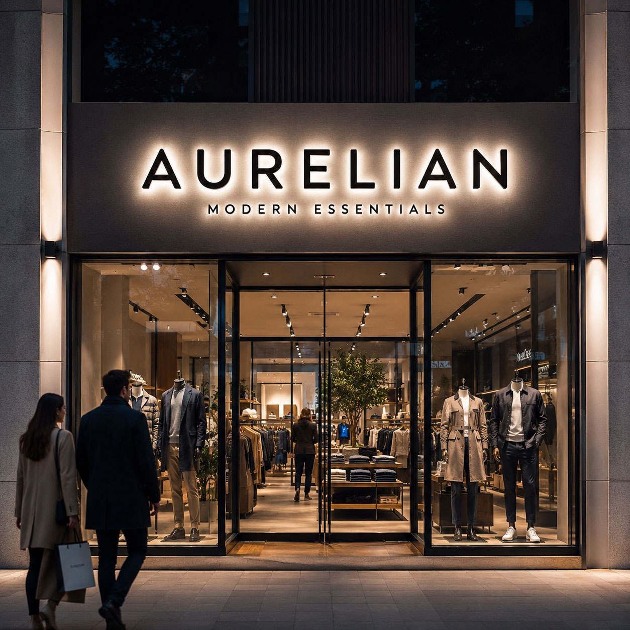
Three dimensional illuminated letters are one of the most effective options for businesses that want their name or logo to remain prominent throughout the day and evening. Unlike a flat printed board, fabricated letters add physical depth to the facade and can create a more architectural appearance.
LED illumination can further improve visibility in shopping streets, malls, commercial complexes, hotels, restaurants, and automobile showrooms. Depending on the desired appearance, letters can use face illumination, halo lighting, or other engineered lighting treatments.
For businesses considering this format, professionally fabricated LED letter signs can be customised through typography, letter depth, mounting method, finish, and illumination style to suit architectural requirements. Uniform illumination is particularly important because inconsistent brightness or visible hotspots can reduce the quality of the installation.
Turn Windows Into Promotional Displays
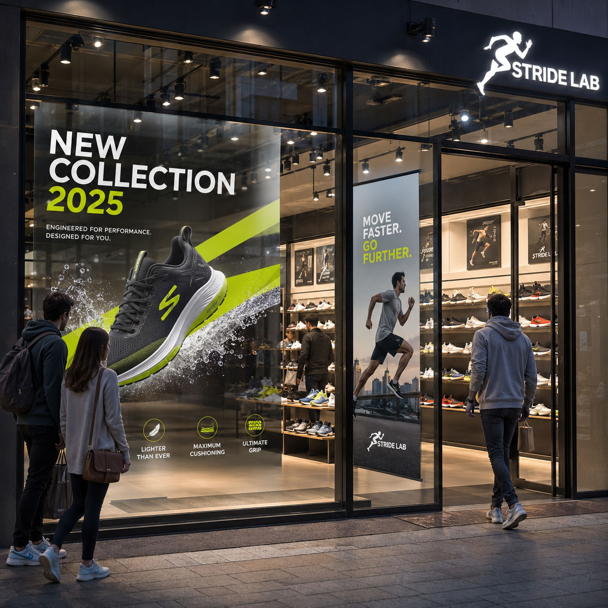
Large glass windows provide valuable communication space without requiring major structural modification. Instead of leaving them empty, businesses can use them to introduce new products, seasonal collections, offers, services, or campaign messages.
For example, a fashion outlet could highlight its latest collection, while a bakery might showcase celebration cakes or festive gifting. Similarly, an electronics shop could feature a newly launched device.
However, window communication should remain selective. Too many graphics, messages, and offers can make the area difficult to understand. Therefore, establish one clear visual hierarchy with a primary message, supporting imagery, and an obvious focal point. This approach makes storefront signage easier to notice from outside.
Create a Strong Entrance Feature
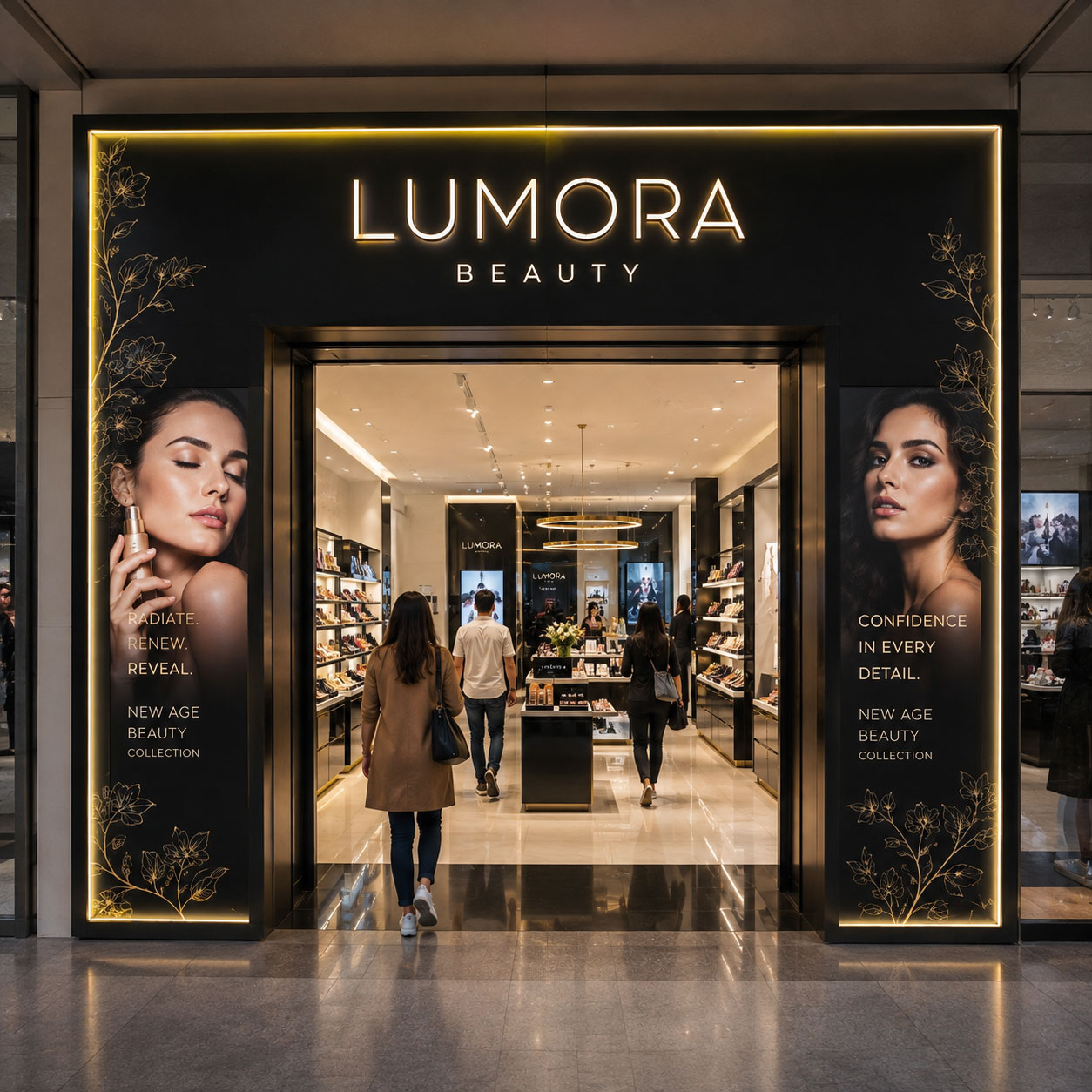
The entrance is one of the most important physical transition points between the street and the customer experience. Therefore, it deserves dedicated visual planning rather than being treated as simply a doorway.
An entrance feature can incorporate architectural frames, overhead identification, illuminated elements, colour treatments, dimensional graphics, or carefully positioned information panels. Moreover, these elements can help visitors immediately recognise where to enter, especially in large commercial environments.
The design should complement the building rather than compete with it. Materials, proportions, illumination, and placement should be selected according to the available facade. When executed correctly, the entrance becomes a recognisable visual asset rather than only a functional access point.
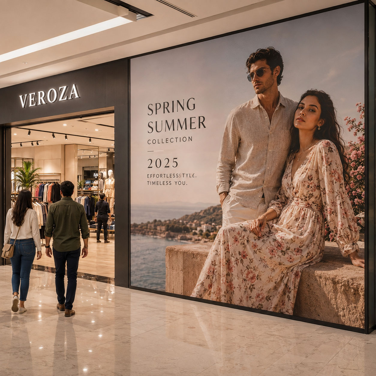
Use Large Format Graphics for Visual Impact
Large format graphics can transform broad walls, glass surfaces, temporary partitions, or other underused areas into high visibility communication zones. They are particularly useful when businesses need to present imagery that cannot be communicated through a logo alone.
A sports retailer, for example, could use an action photograph featuring its latest footwear range. A beauty brand could showcase a campaign visual, while a restaurant could present signature dishes through professionally photographed imagery.
Additionally, graphics can be changed when campaigns evolve. This provides greater flexibility than permanent architectural elements. Nevertheless, image resolution, colour reproduction, installation quality, and viewing distance should all be considered before production. Poor quality enlargement can weaken an otherwise strong concept.
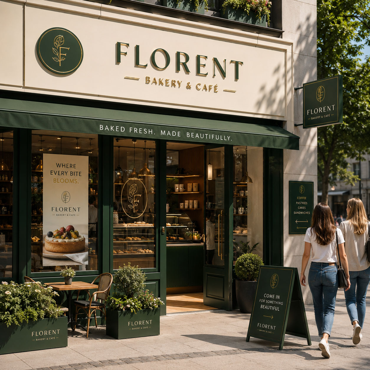
Develop a Consistent Colour System
Colour is often recognised before words are read. As a result, a consistent colour system can make a physical location easier to identify from a distance.
Instead of applying multiple colours without hierarchy, select a controlled palette based on the established brand identity. Primary colours can define major architectural zones, while secondary shades can support entrances, information panels, graphics, and smaller details.
Moreover, consistency becomes particularly valuable for businesses operating several locations. Customers should be able to recognise the organisation even when individual buildings have different dimensions or architectural characteristics.
Among practical storefront branding ideas, colour is especially useful because it can connect signage, walls, windows, fixtures, packaging, uniforms, and promotional materials into one recognisable visual language.
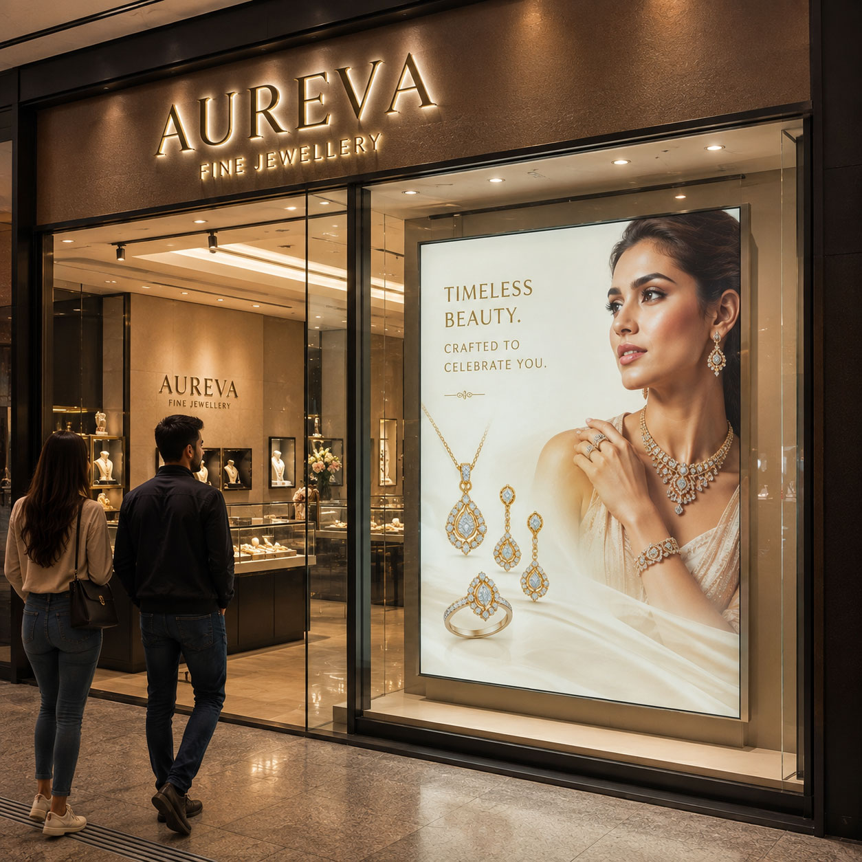
Add Illuminated Fabric Graphics
Illuminated fabric displays can provide a clean solution for businesses that want large, bright campaign imagery with a premium appearance. These systems are particularly suitable behind glass, inside entrances, along feature walls, or in areas where changing campaigns is important.
A tensioned fabric graphic can present product photography, promotional artwork, new launches, or lifestyle imagery across a substantial visual area. Meanwhile, internal illumination helps the graphic remain visible in lower ambient light.
For professional results, the fabric should remain properly tensioned from edge to edge, while illumination should be uniform across the entire graphic. Additionally, the frame should integrate neatly with the surrounding architecture. This combination makes illuminated graphics suitable for fashion, automotive, beauty, hospitality, and premium retail environments.
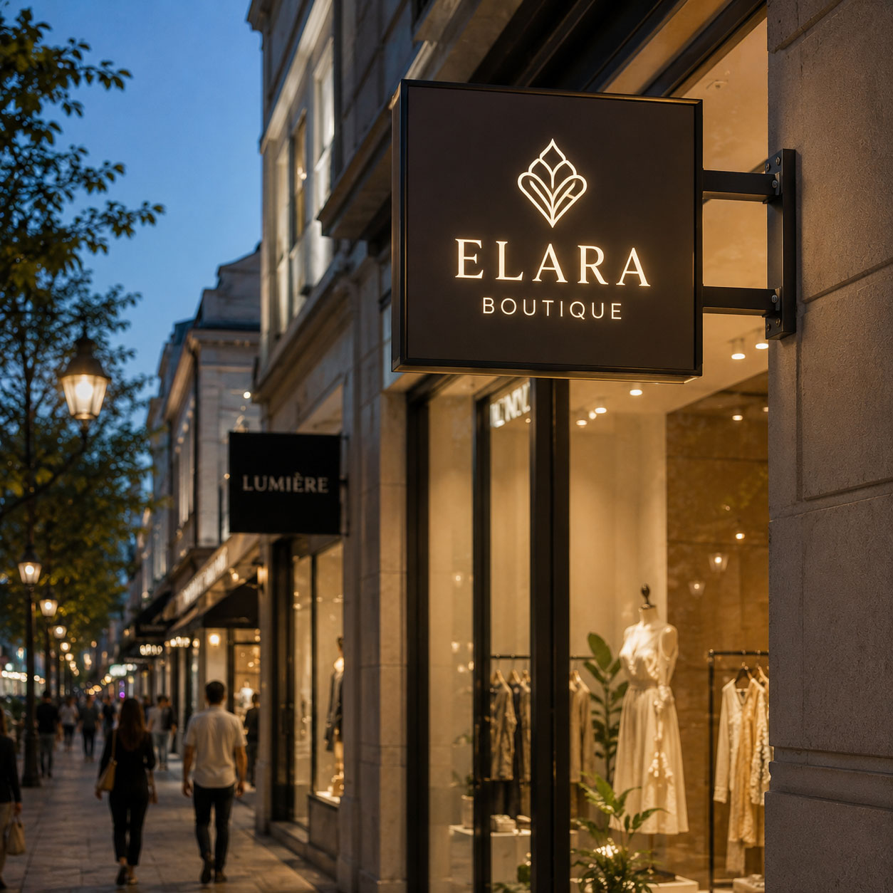
Use Projecting Signs for Side Visibility
Traditional facade signs primarily communicate with people standing directly in front of a business. However, pedestrians often approach from either side of a street. A projecting sign can address this visibility challenge.
Mounted perpendicular to the building, these signs allow the business identity to be noticed before someone reaches the entrance. Consequently, they can be particularly effective in markets, shopping streets, hospitality districts, and pedestrian heavy commercial areas.
The design should remain simple because the available viewing time may be short. A logo, symbol, or concise name generally works better than detailed information. Additionally, dimensions and mounting positions should be planned according to the site and applicable local requirements.
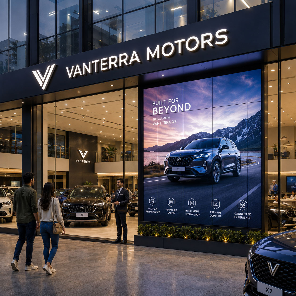
Combine Digital Screens With Permanent Signage
Digital screens allow businesses to change communication without physically replacing printed material. They can feature new launches, promotional campaigns, product demonstrations, menus, seasonal messages, or event information.
However, digital technology works best when supported by permanent identification. The business name and core identity should not disappear simply because the screen content changes. Instead, permanent signage establishes recognition while digital media provides dynamic communication.
This combination can be valuable for automobile showrooms, electronics stores, restaurants, shopping centres, jewellery stores, and experience centres. In addition, content should be designed for quick comprehension. Excessive text, rapid transitions, or complicated animations may reduce effectiveness when viewers have only a few seconds to notice the message.
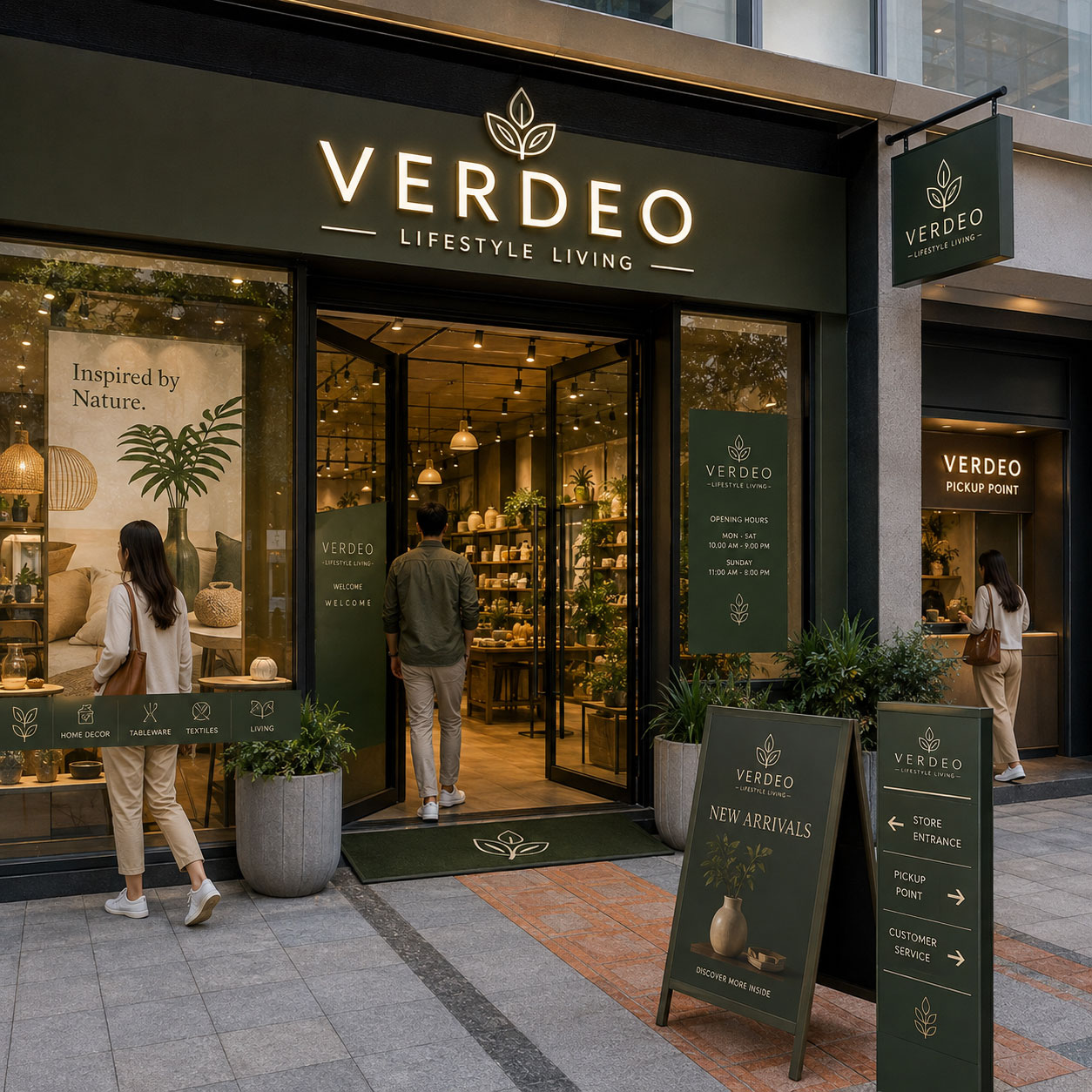
Extend the Experience Beyond the Main Sign
The main sign establishes your business identity, but the customer experience should continue across other visible touchpoints. Door graphics, window decals, directional signs, opening hours, promotional panels, product category markers, and pickup signs can make the location easier to understand and navigate.
Additionally, using consistent colours, typography, materials, and icon styles creates a connected visual experience. Each element should serve a clear purpose without making the space feel cluttered.
For larger stores, showrooms, restaurants, and commercial spaces, these supporting elements can guide customers from the street towards the entrance and important service areas. Therefore, instead of treating every sign as an individual installation, plan them as coordinated communication points that strengthen recognition while helping customers move confidently through the location.
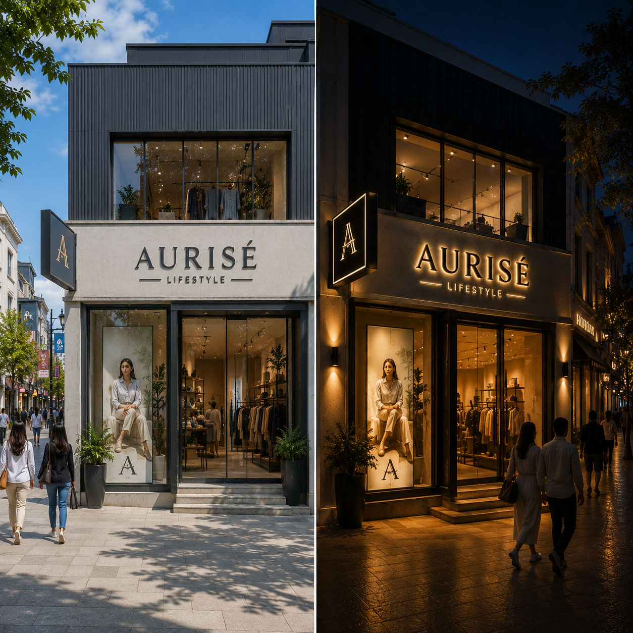
Design for Both Day and Night Visibility
A facade that looks impressive at noon may become almost invisible after sunset. Therefore, lighting conditions should be considered from the beginning of the design process.
Illuminated letters, backlit graphics, controlled architectural lighting, window displays, and strategically positioned light sources can help maintain visibility after dark. Nevertheless, more brightness does not automatically produce better results. Excessive illumination can create glare and make important details harder to read.
Instead, establish a clear hierarchy. The business name should remain easy to recognise, while supporting elements should complement rather than compete with it. For businesses operating into the evening, this can substantially extend the useful communication time of the exterior.
How to Choose the Right Storefront Branding Ideas?
Not every concept is suitable for every location. A luxury boutique, neighbourhood bakery, automobile dealership, corporate experience centre, and electronics outlet have very different communication requirements.
Before selecting materials or formats, evaluate:
- Typical customer viewing distance
- Pedestrian and vehicle movement
- Daytime and nighttime conditions
- Available facade dimensions
- Existing architectural features
- Brand guidelines
- Frequency of promotional changes
- Installation and maintenance requirements
- Local signage regulations
- Budget and expected service life
Additionally, consider which elements should remain permanent and which need regular updates. The company name may require a long term architectural solution, whereas seasonal promotions may be better suited to replaceable graphics or digital displays.
Why ChooseGogia Print-O-Grafix?
Gogia Print-O-Grafix helps businesses transform branding concepts into professionally executed signage and visual communication solutions. Every project is planned according to the location, viewing distance, architectural environment, brand guidelines, and communication objective.
From a single outlet to a larger multi location branding requirement, the focus remains on creating solutions that are visually effective, professionally fabricated, and suitable for practical commercial use.
Businesses can work with Gogia Print-O-Grafix for:
- LED letter signs for prominent day and night brand visibility
- Fabric light boxes for bright, evenly illuminated promotional graphics
- Large format graphics for walls, windows, campaigns, and commercial spaces
- Retail branding solutions for stores, showrooms, and customer facing environments
- Custom signage designed around specific architectural and brand requirements
With a focus on quality fabrication, clean finishing, uniform illumination, and professional installation, Gogia Print-O-Grafix delivers reliable signage solutions that help businesses improve visibility and build a consistent, professional presence.
Fill the Enquiry Form Below!
Conclusion
A well planned business exterior can do much more than identify a location. It can attract attention, communicate brand personality, highlight products or services, and create a strong first impression before customers enter. The most effective approach combines clear communication with thoughtful design, appropriate materials, professional fabrication, and careful installation.
The storefront branding ideas discussed in this guide provide different ways to improve visibility across stores, showrooms, restaurants, offices, salons, and other commercial spaces. Illuminated letters can strengthen brand recognition, while window graphics and fabric light boxes provide space for promotional campaigns. Similarly, projecting signs can improve visibility from different directions, while digital displays allow businesses to communicate frequently changing messages.
However, adding more visual elements does not necessarily create a stronger result. Every sign, graphic, display, colour, and lighting element should have a clear purpose and complement the surrounding architecture.
Before selecting a solution, businesses should consider viewing distance, customer movement, operating hours, available space, campaign requirements, and long term maintenance. A coordinated approach helps create an exterior that remains professional, recognisable, and relevant while supporting a consistent customer experience across every physical brand touchpoint.

Related Posts
Portable Promotional Displays for Retail Stores, Events and Brand Campaigns
Discover how portable promotional displays create flexible, illuminated and…

10 Ways Retail Network Branding Creates Consistent Customer Experiences
Discover how standardised LED promotional frames help brands create consistent…

Shop Renovation Ideas That Do Not Require Major Interior Changes
Explore practical shop renovation ideas that refresh customer facing spaces…